
SAE-REN / LUXURY BEAUTY IDENTITY SYSTEM
One identity.
Room to grow.
A beauty lounge, an expanding product range, and a complete brand system connecting skincare, makeup, digital and the spaces in between.
The brief
Make each new category feel like part of the same brand.
SAE-REN began with a beauty lounge and two skincare directions, PURE and GLOW. Over an initial 12-month engagement, the work grew to include further treatments, makeup, digital design and rollout support.
The challenge was to give each range its own character while keeping the hierarchy, materials and brand language coherent as the business expanded.
What I created
From identity decisions
to vendor-ready detail.
- 01Logo architecture
- 02Typography & color
- 03Skincare packaging
- 04Makeup packaging
- 0519-page website design
- 06Production specifications
- 0750+ page brand guidelines
- 08Launch & rollout direction
01 / Identity & guidelines
A framework
for every expression.
The logo hierarchy, typography, color roles and layout rules established a common language. Product families could then change their material or finish without losing recognition.
The guidelines document that logic across packaging, photography direction, digital applications and production, giving the client and external vendors a shared reference.
for use beyond the design phase
02 / Skincare packaging
Different rituals.
A shared hierarchy.
Treatment cases, ampoules, inserts and sleeves follow a consistent product structure. Controlled differences in color, finish and material separate PURE, GLOW and later treatment directions while keeping the range recognisable.
Product renders and design presentations show the intended packaging system and material direction.
03 / Makeup packaging
A stronger expression.
The same identity.
Matte black, metallic gold and debossing give the makeup range a more concentrated visual character. The logo hierarchy and typographic structure stay connected to the master brand across different component formats.
04 / Production capabilities
The details that
make it producible.
The handoff defines dielines, component dimensions, materials, color references, foil and debossing. Manufacturers receive specific instructions for how the design should be reproduced across each packaging format.
Selected production presentation slides. Click any artwork to enlarge it.
05 / Digital design
The brand experience,
continued online.
A 19-page website design in Figma connects the beauty lounge, skincare, makeup, treatments and product education. Navigation, page hierarchy and content pacing carry the same brand logic from physical products into the digital experience.
06 / Launch & seasonal direction
A reference for
what comes next.
Before a complete photography library existed, visual direction established composition, color hierarchy and product presentation for early launch content. Seasonal artwork then extended the same brand into new occasions and retail applications.
I designed the seasonal window artwork and its visual application. The social-direction examples were included as additional guidance within the brand guidelines.
07 / Physical brand applications
Recognition in
the real world.
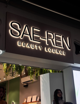
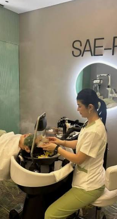
The wordmark, monogram, window artwork and graphic details carry into SAE-REN’s completed beauty lounges. The location photographs show the identity in use, from the storefront to branded details inside.
Identity, logos, brand graphics and seasonal window artwork: Mariya Vasileva. Interior design, fabrication and installation: SAE-REN’s selected team.
On location
Media coverage / Asia361
Inside SAE-REN.
Asia361’s feature offers a look inside the beauty lounge, with the identity visible in the signage and surroundings.
Video by Asia361. Interior design and execution by SAE-REN’s selected team.
08 / In motion
See the identity unfold.
The case study and a short visual overview.
Videos load from YouTube when you press play.
The result
A system built
to keep expanding.
During the engagement, SAE-REN grew beyond its initial skincare directions into further treatments and makeup, and launched a second location within six months.
The identity, packaging, website design and production guidance gave those additions a common starting point. Each new format could build on established decisions.
“Her attention to detail and commitment to quality are truly exceptional.”
Dror A.
SAE-REN Beauty Lounge (SBL)