Mariya Vasileva
SELECTED WORK / SUPPLEMENT & FLEXIBLE PACKAGING

Design that carries
into production.

Packaging for nutrition, performance and wellness products—from developing the visual system to adapting it across formats and preparing detailed artwork when production is part of the commission.
Cross-format design
tubes · sachets · bottles · cartons
Original concepts & refinement
Clear hierarchy across SKUs
Manufacturing handoff
Illustrator artwork & print specifications
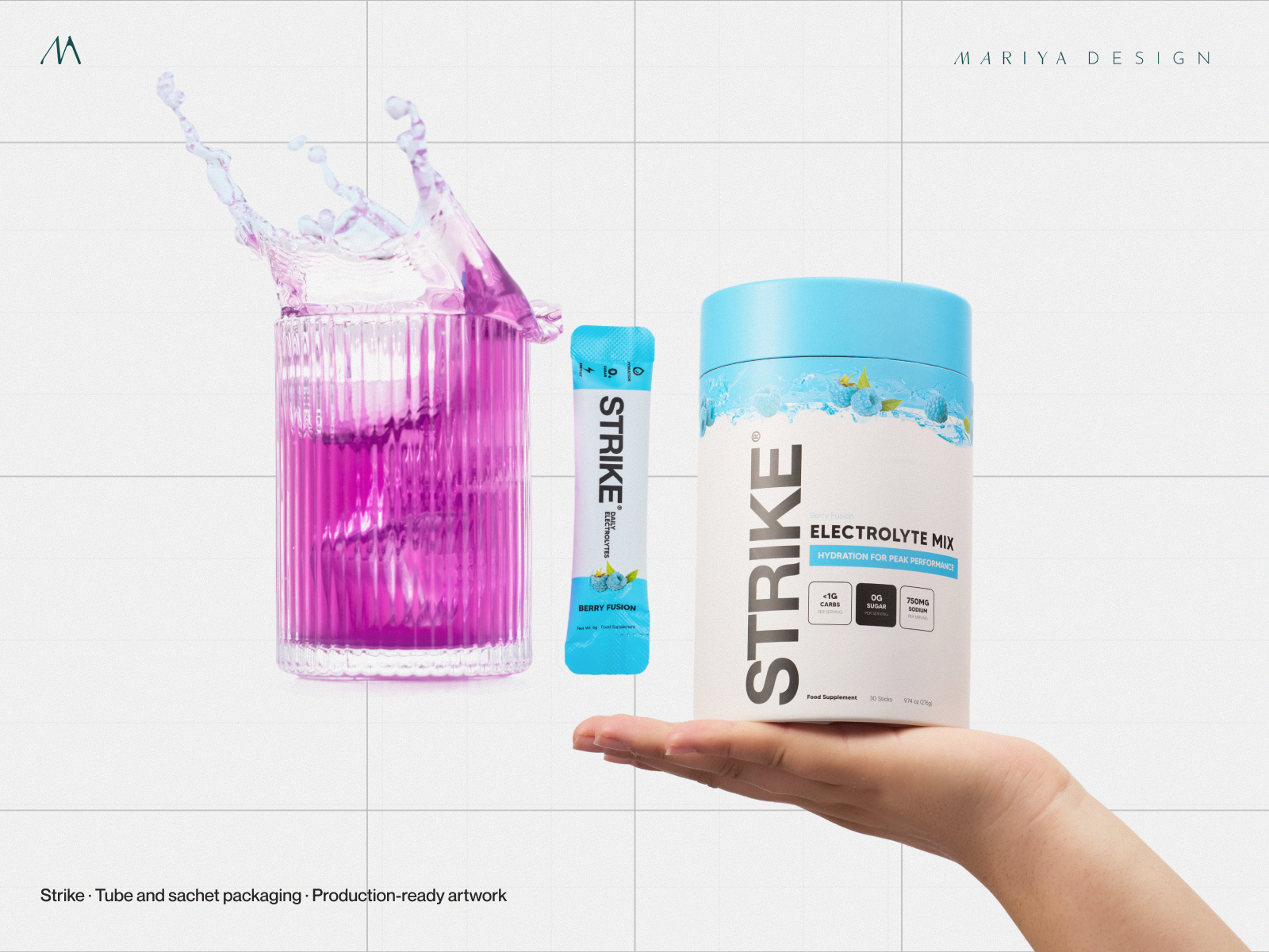
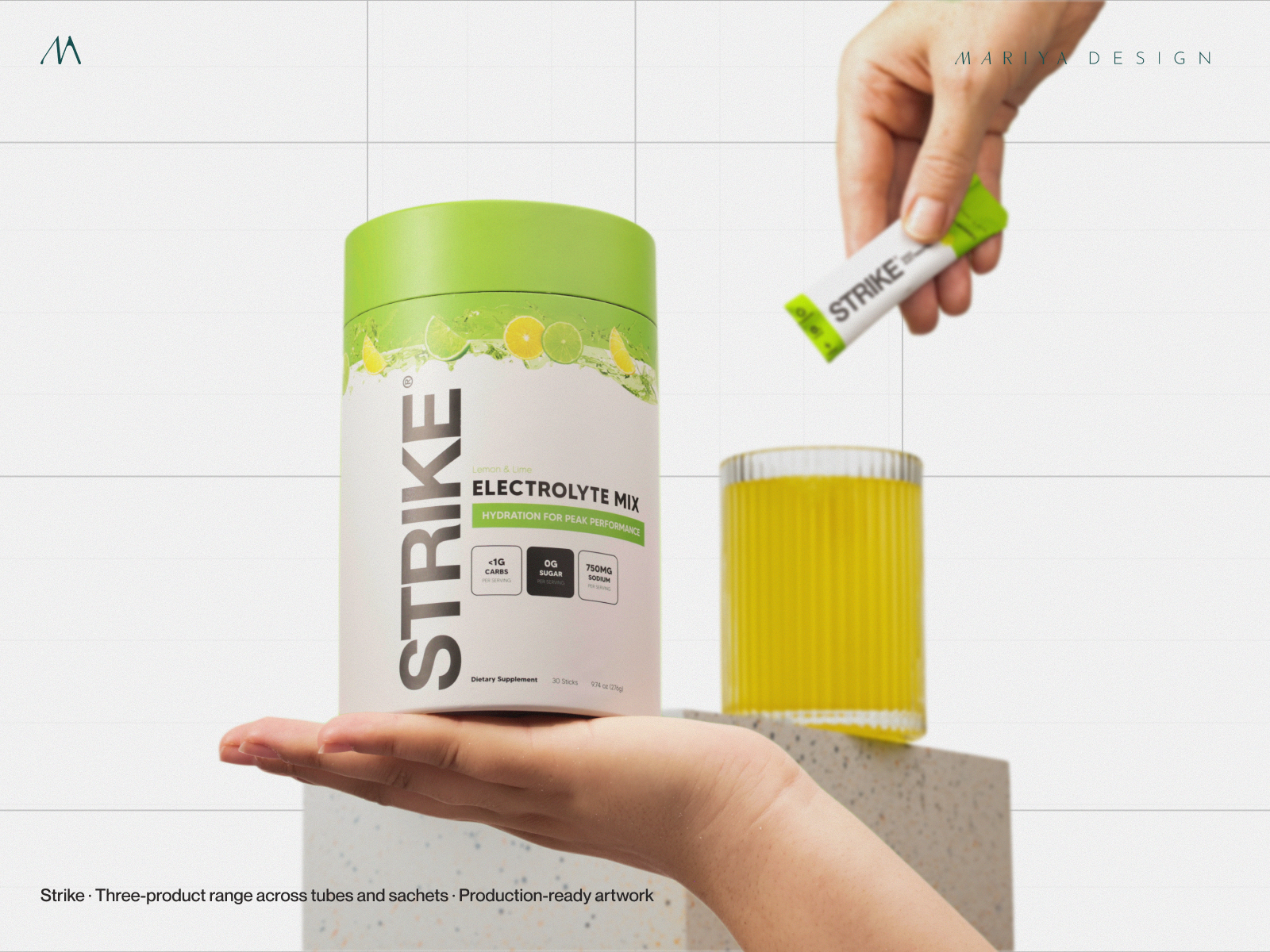
Original Strike Nutrition tubular pack design Original Strike Nutrition single-serve sachet design
Strike Nutrition — original tube and single-serve sachet packaging artwork. Project imagery presented at enlarged scale; tap for a closer look.
01 / STRIKE NUTRITION — UK

One family.
Different formats.

My original packaging work covered tubular containers, single-serve sachets, sampler formats and flavor variants. A stable brand mark, flavor coding and claim structure made the range recognizable as it moved between formats.
Sachet designPackaging architectureSKU differentiation
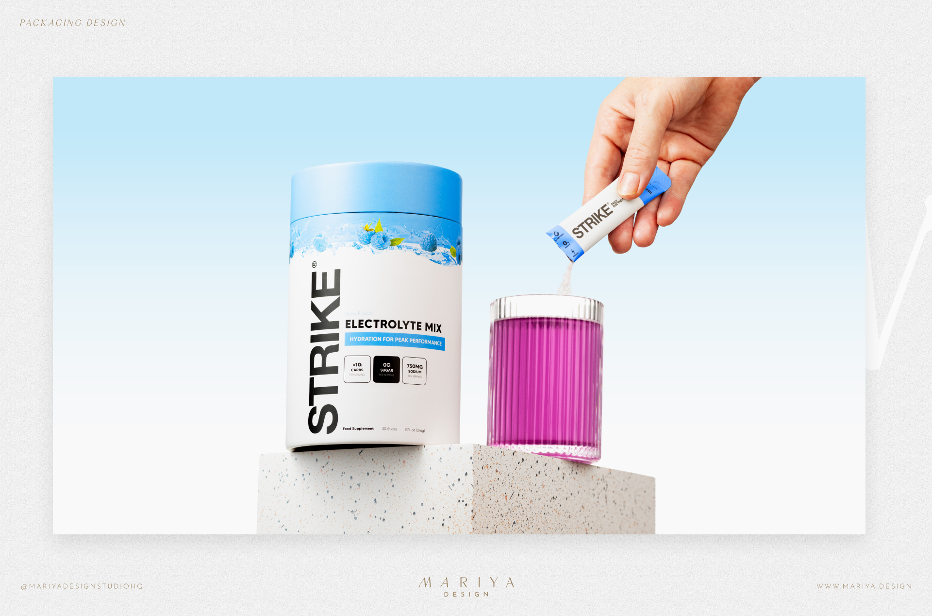
Strike Nutrition tube packaging variants
Tubular product format — constrained space, retained vertical brand recognition and clear product claims.
Strike Nutrition original sachet packaging
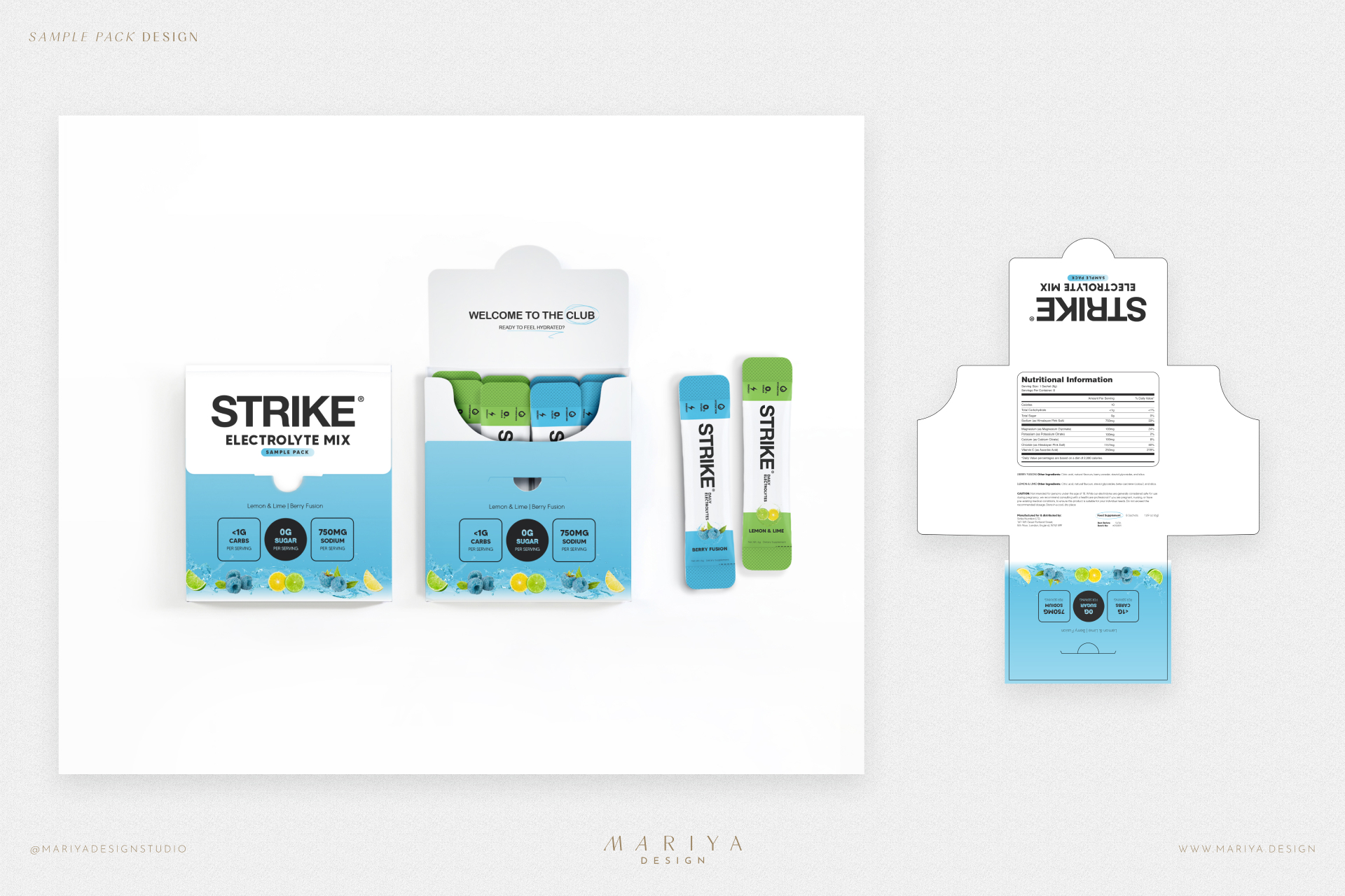
Strike Nutrition sampler packaging format

Design problem

Keep brand hierarchy and variant recognition intact as dimensions, use cases and available panel space change.

My contribution

Original packaging and variant system for the commissioned formats. Later third-party large-pouch adaptation was outside my contracted design scope.

01A / STRIKE NUTRITION — ORIGINAL ARTWORK

From design
to the dieline.

The original working artwork shows how the packaging moved beyond mockups. These are actual layouts for the commissioned formats, with dimensions, panel relationships, product information and production guides visible.

01 / 2023Two tubular packsThe initial format and flavor system.
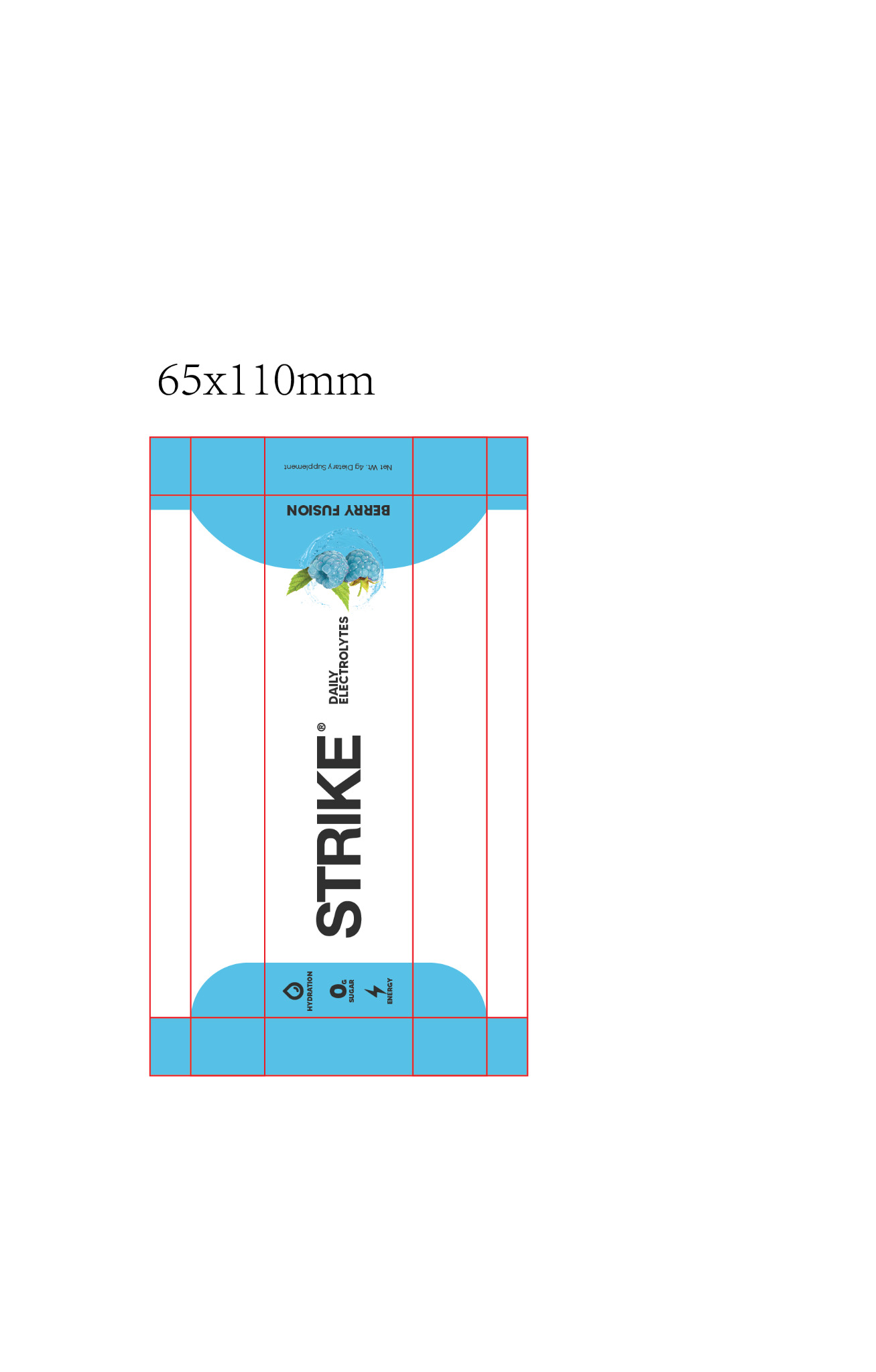
02 / 2023Two single-serve sachetsAdapted to a 65 × 110 mm format.
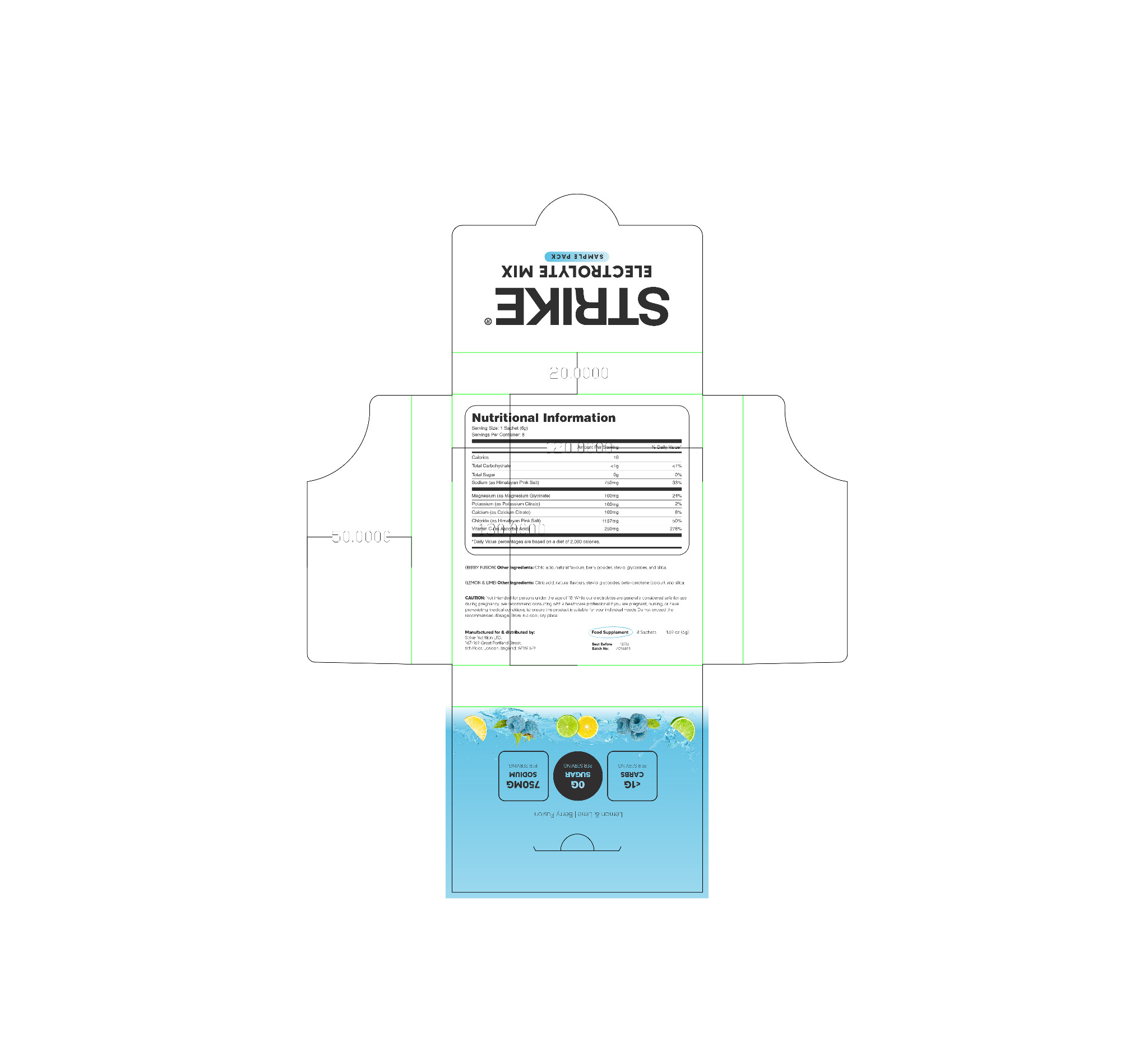
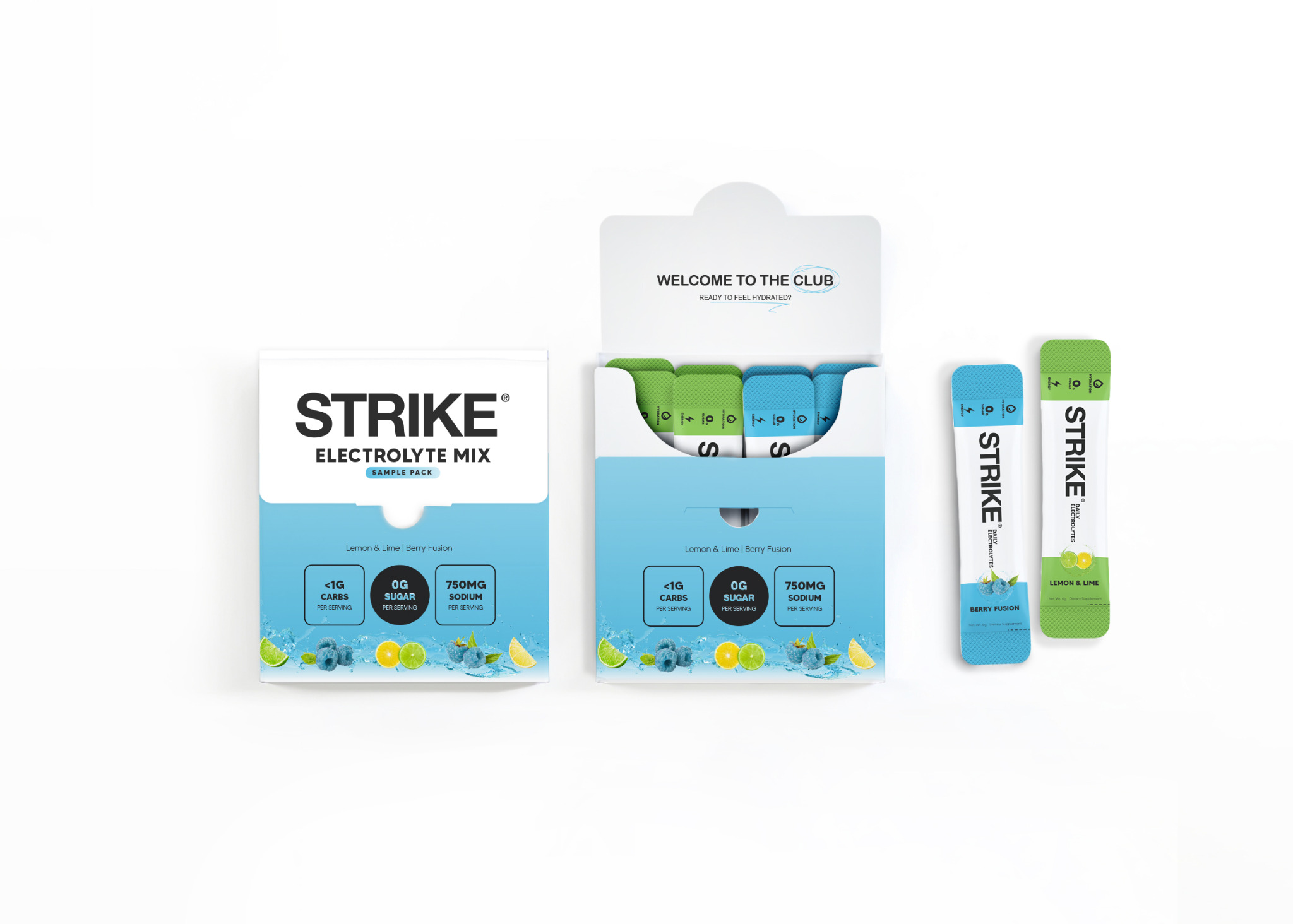
03 / 2024Sampler packNew carton structure and mixed-flavor presentation.
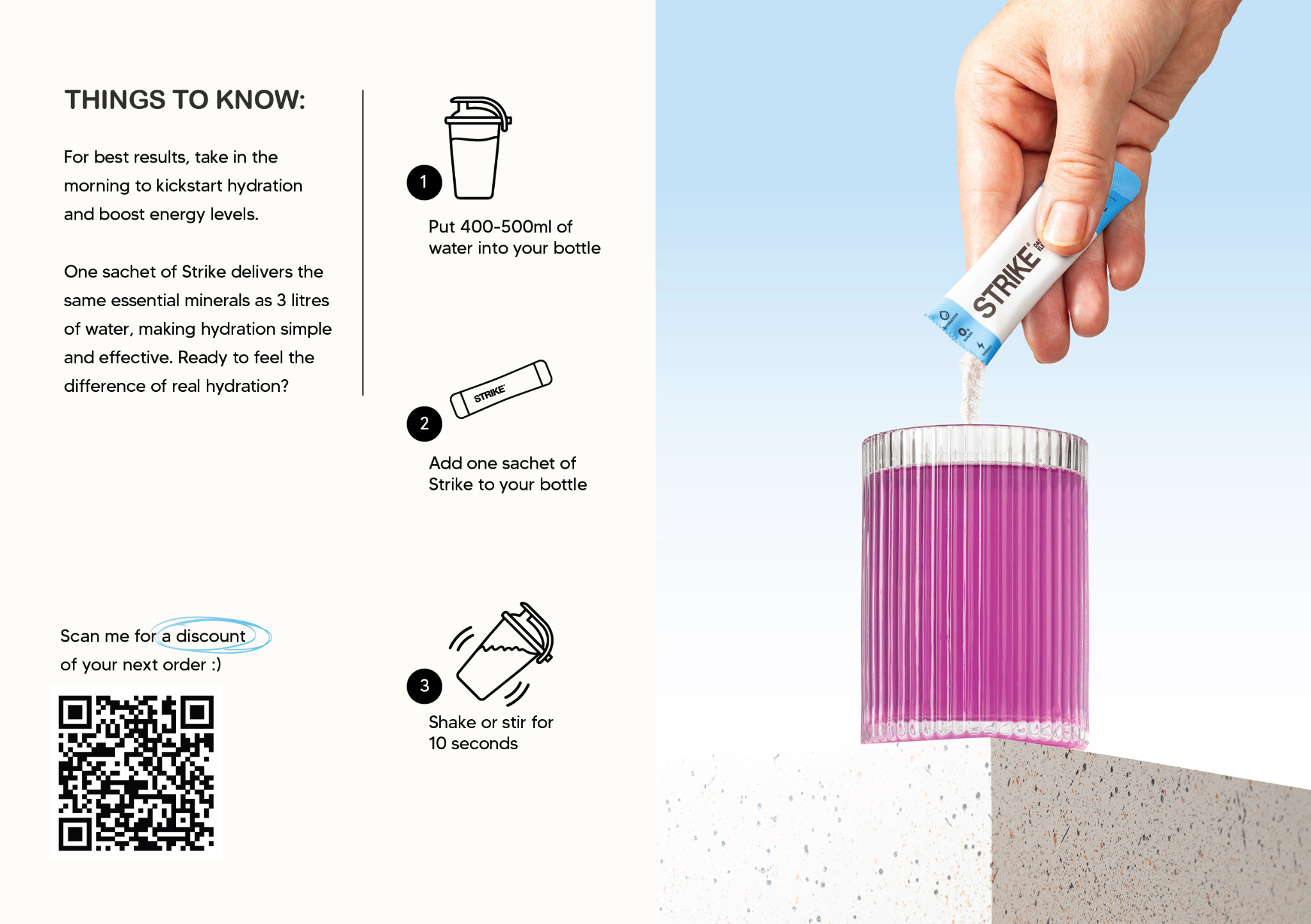
04 / 2025Orange extension + insertsAdditional flavor and supporting printed material.

01 / FLEXIBLE FORMATOriginal sachet production artwork
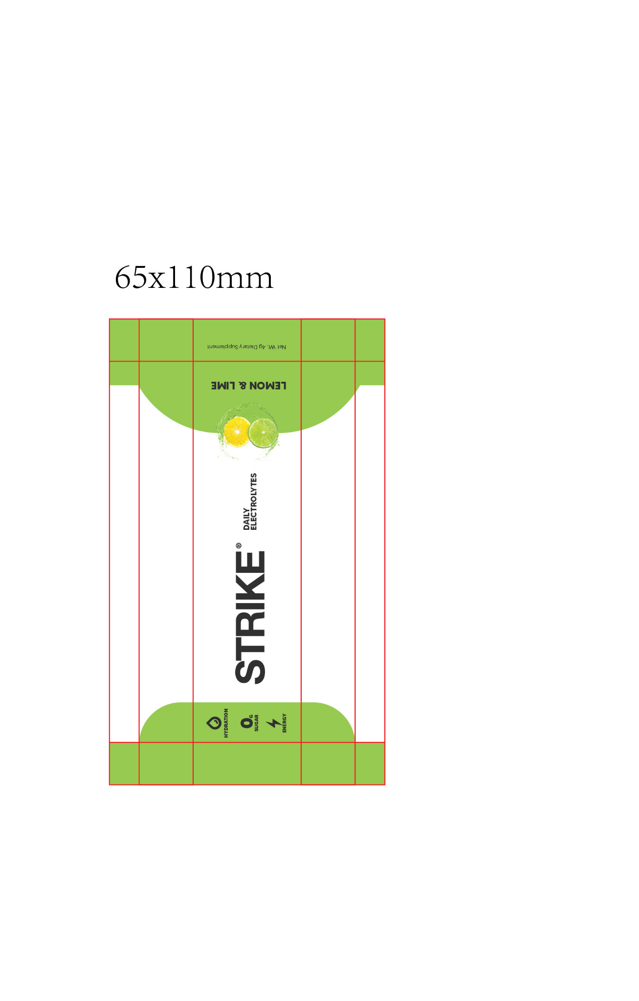
Original Strike Nutrition Lemon and Lime 65 by 110 millimeter sachet dieline with panel and fold guides
Lemon & Lime / 65 × 110 mm. Original sachet layout on the working structure.
Original Strike Nutrition Berry Fusion 65 by 110 millimeter sachet dieline and flavor artwork
Berry Fusion / 65 × 110 mm. Shared hierarchy and distinct flavor coding.

02 / TUBULAR FORMATLabels, ingredients and panel relationships
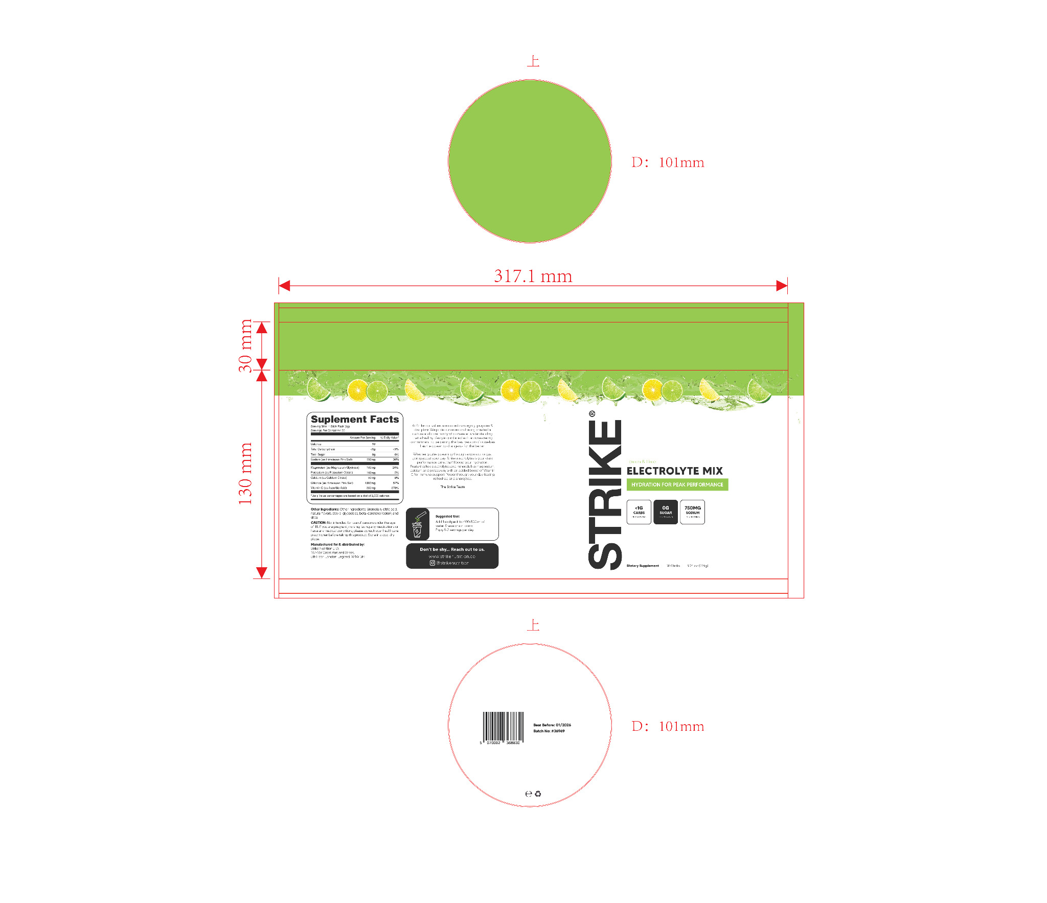
Original Strike Lemon and Lime cylindrical container wrap and top and bottom artwork showing Supplement Facts and dieline
Lemon & Lime / 101 mm diameter, 160 mm height. Cylinder wrap plus top/bottom artwork, product information and guides.
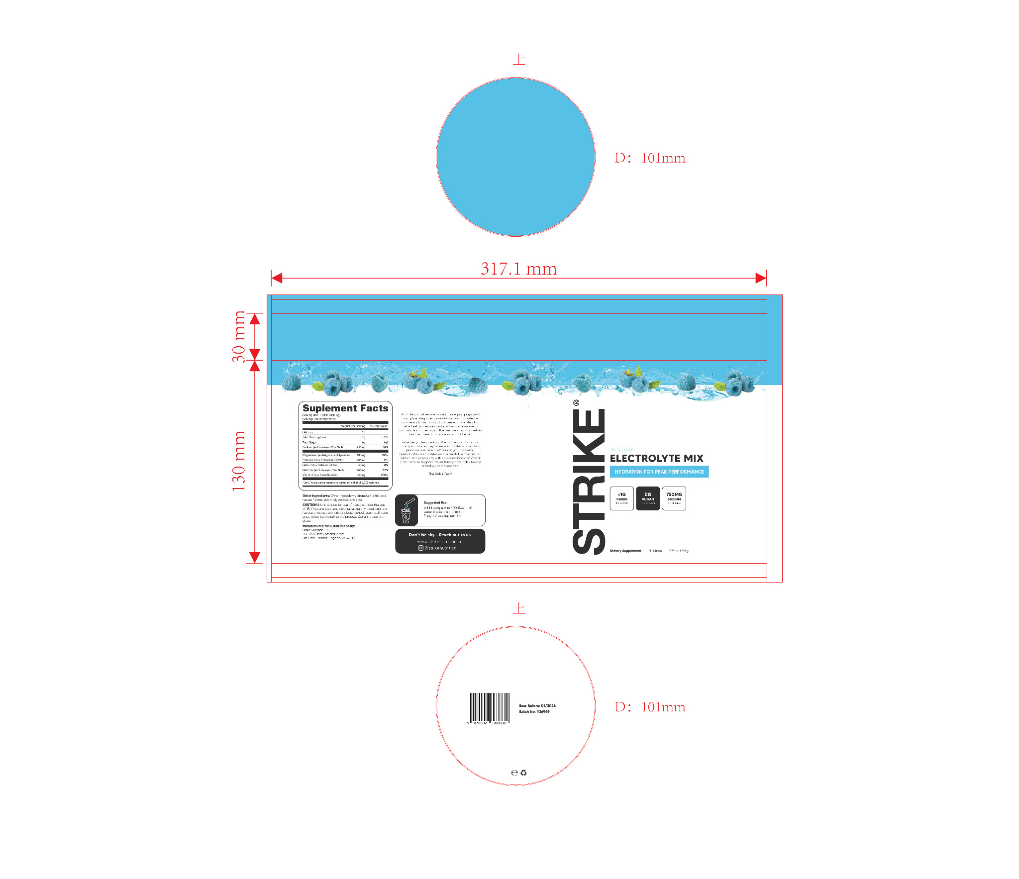
Original Strike Berry Fusion cylindrical container artwork with complete print guides and nutritional information
Berry Fusion / the same format, translated across the full artwork rather than just the front image.

03 / FORMAT EXTENSIONSampler carton
04 / RANGE EXTENSIONOrange flavor and printed insert
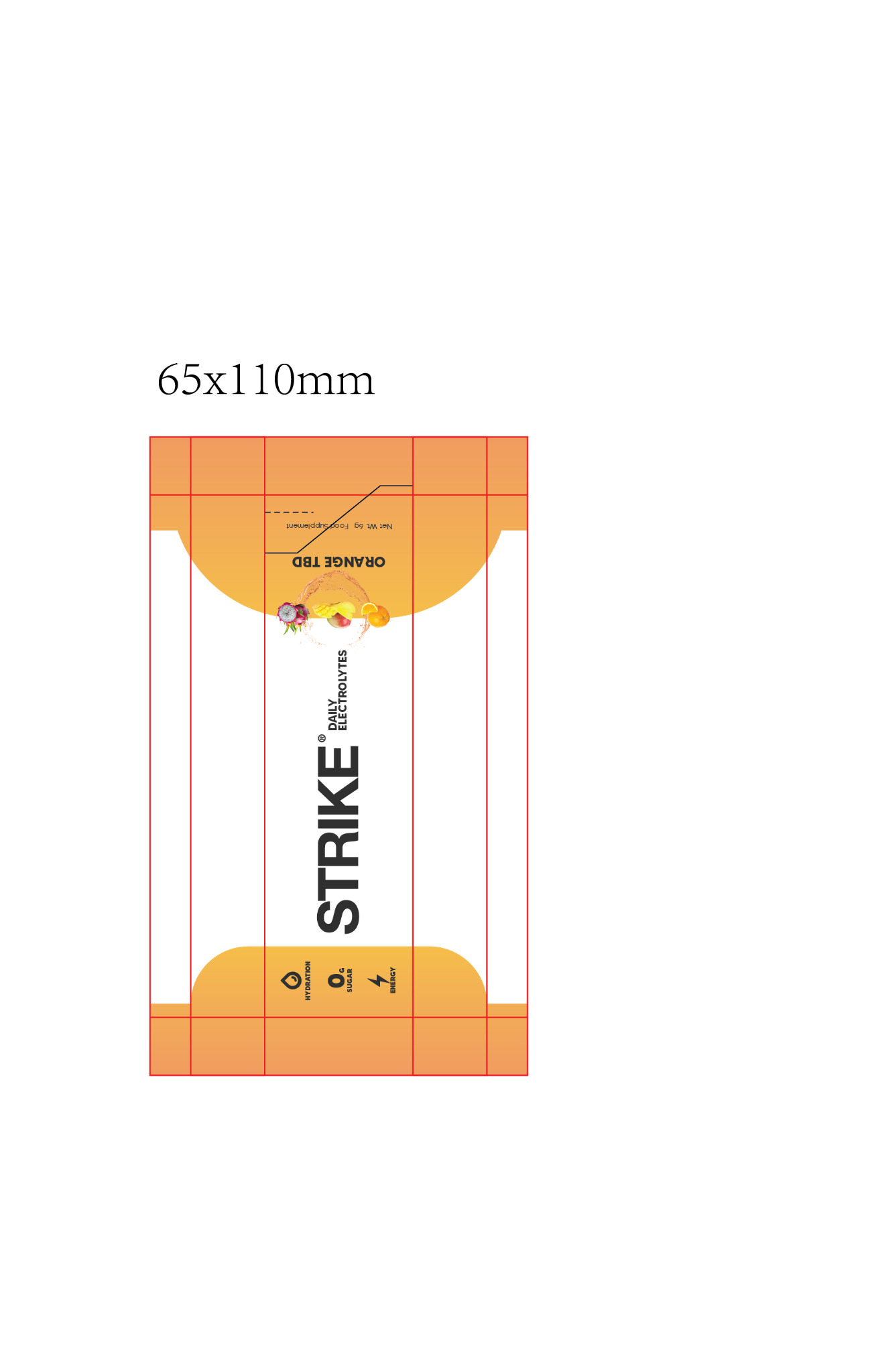
Strike Nutrition orange flavor single serve sachet original flat artwork and dieline
Orange / sachet artwork, March 2025. An additional flavor added to the same system.
Strike Nutrition printed educational leaflet artwork with consumer instructions and product information
Supporting print / 2025 leaflet with consumer information and usage guidance.

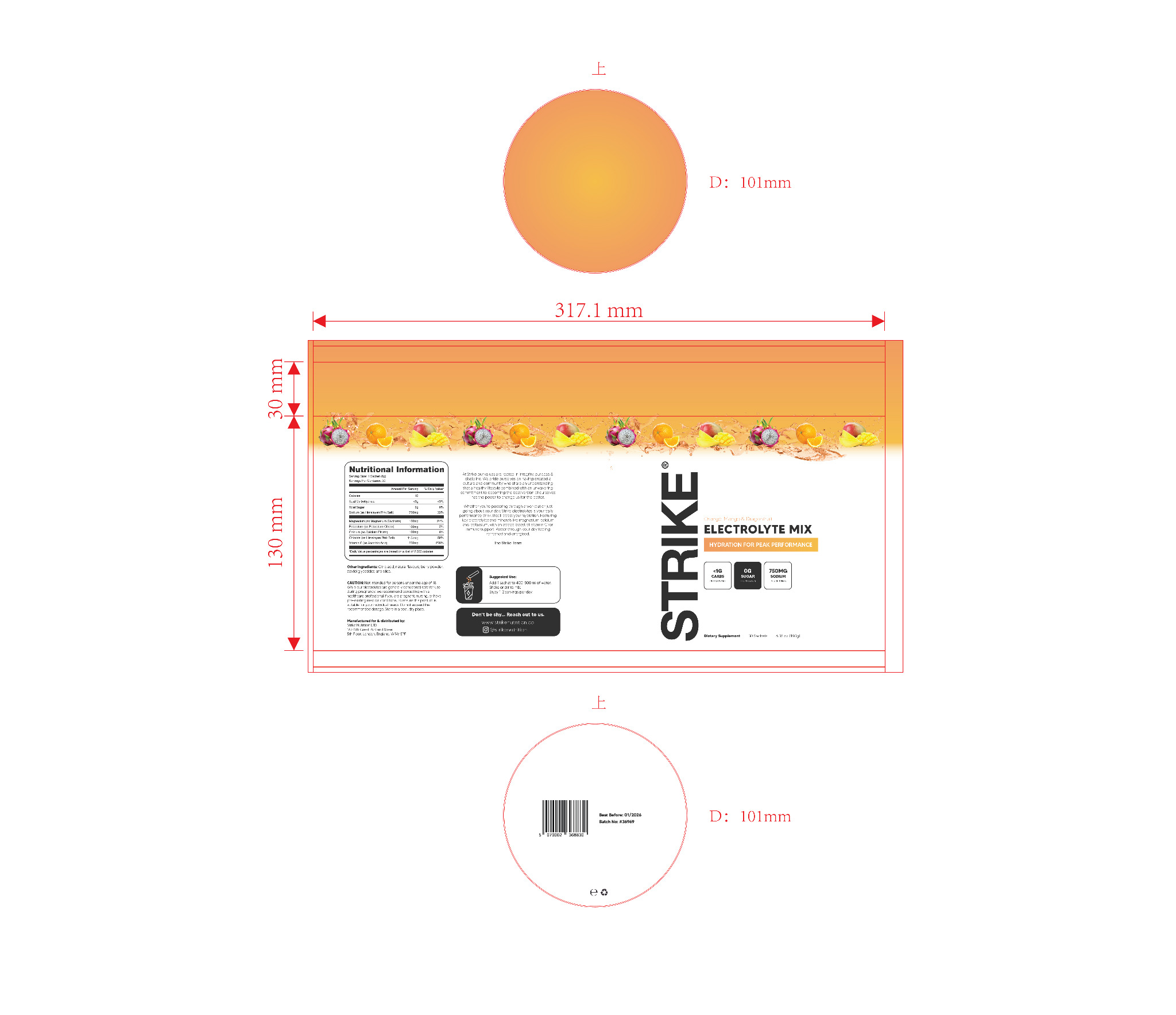
04B / ORANGE RANGEMatching tubular-pack artwork
Orange extension print artwork showing the complete cylindrical tub wrap
Orange / full tube wrap, dated March 2025. Additional flavor adapted across the same physical package system.
Authorship & boundaries

I personally designed the original tubular packs, two 65 × 110 mm sachets, sampler carton and later orange flavor. The larger-format pouches subsequently developed by the client were not part of my commissioned production artwork. These supplied artwork views demonstrate my design preparation; supplier proofing and manufacturing approval remain separate stages.

02 / TAME NUTRITION + TRUESHIELD

A considered concept.
Prepared for print.

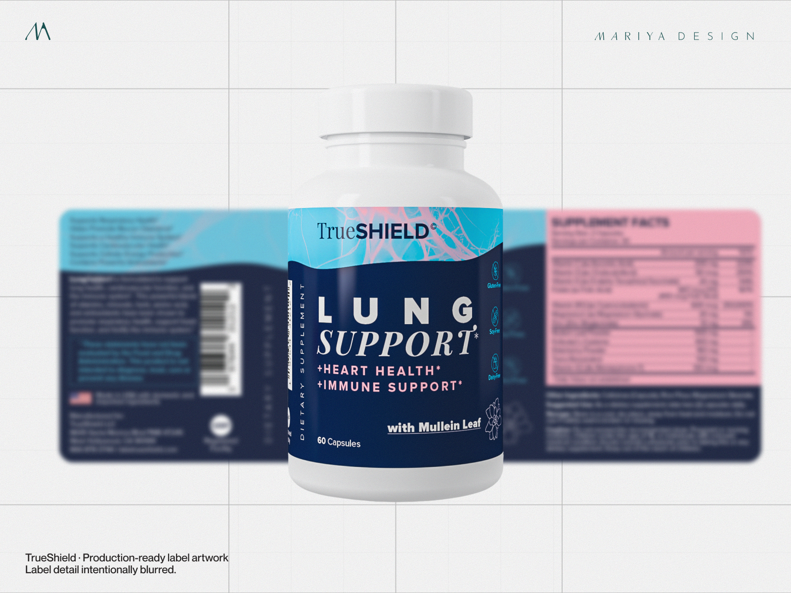
Different assignments require different stopping points. These projects show packaging taken beyond presentation imagery into organized production-ready label artwork. They also distinguish finished artwork from format studies.
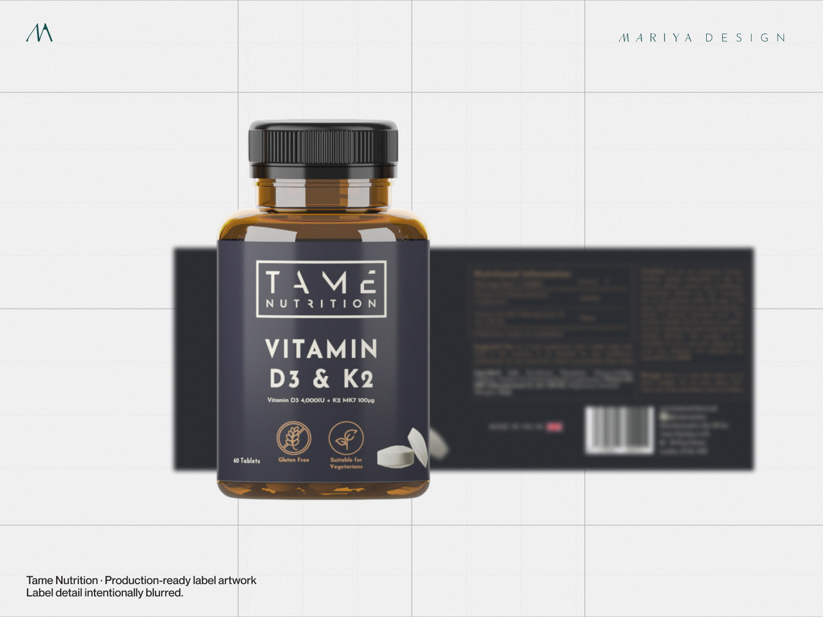
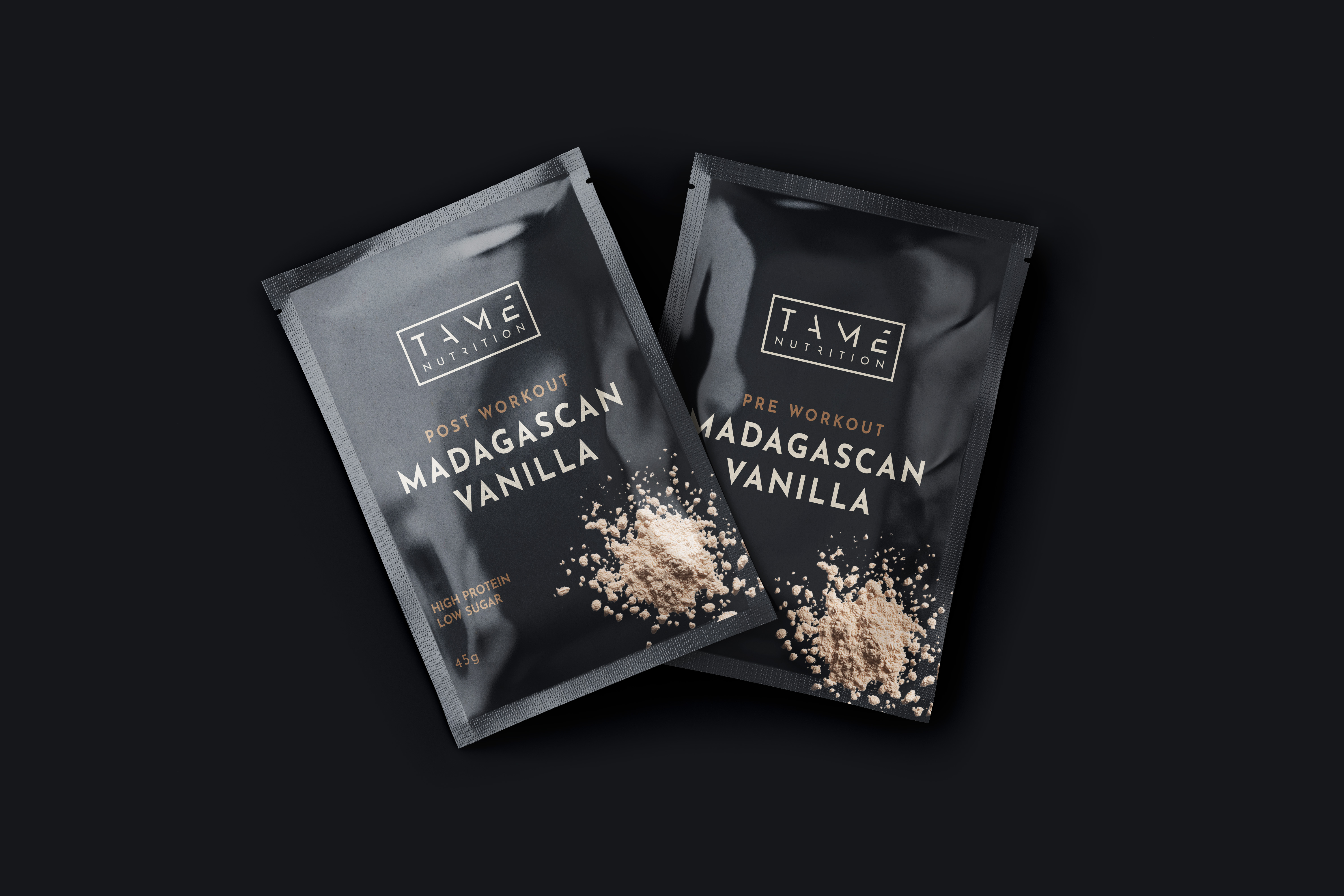
Tame Nutrition production label artwork example
Tame Nutrition — bottle label artwork developed for production. Sensitive supplier details are obscured.
TrueSHIELD production-ready supplement label artwork example
TrueSHIELD — finished production-ready label design alongside brand presentation. Sensitive details obscured.

Production artwork

Typography, ingredient and claim hierarchy, precise label layouts, native working files and print exports follow confirmed specifications and approved copy.

Scope of responsibility

The client and its vendors retain product formulation, legal label compliance, manufacturing feasibility, printer proofs and final production approval.

03 / TAME NUTRITION + L8 LIFE

Make the system
adaptable.

A brand system has to work beyond its first format. These selections show adaptation into smaller sachet applications and controlled multi-product concepts, while retaining the same family resemblance.
Small-format hierarchyFlavor distinctionsConcept studies
Tame Nutrition sachet packaging concept
Tame Nutrition — exploratory sachet applications translated from the parent bottle identity. Concept, not a claim of printed sachet production.
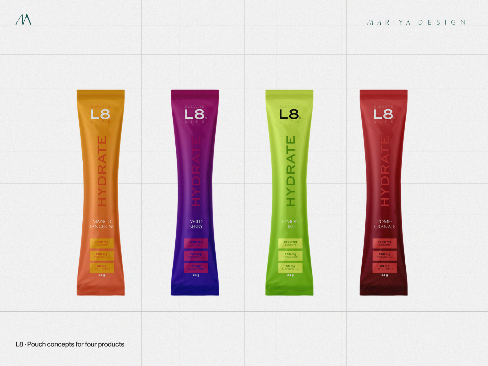
L8 Life multi-flavor pouch packaging concepts
L8 Life — four-variant pouch direction exploring palette, typography and cross-SKU recognition. Early concept study, not finished manufacturing artwork.
HOW I WORK / REFINEMENT + PRODUCTION

The right finish is
not another redesign.

01 / REVIEW

Protect what works.

Audit the existing Figma files, source assets and approved direction. Identify inconsistencies and the gaps that still block production.

02 / RESOLVE

Finish the system.

Confirm the wordmark, flavor logic, front/back hierarchy, variants and content architecture across the actual packaging formats.

03 / PREPARE

Work to the dielines.

Build Illustrator artwork against supplied production specifications, accounting for bleed, seal areas, inks, finishes and supplier-specific layers.

04 / HANDOFF

Leave usable files.

Deliver organized native artwork, placed assets and printer-required PDF exports with clear written notes for internal and manufacturing teams.

Every supplier and substrate is different. Final color profiles, white underprint, finish layers, dieline tolerances and proofing requirements are established from the manufacturer’s specifications—not assumed from a rendered pouch image.

Selected project artwork
Enlarged project artwork