
Built to inspire. Made to inform.
Senior multidisciplinary brand and creative designer, working from editorial direction through hands-on InDesign production. Selected product catalogs, regional editions, and printed brochures by Mariya Vasileva.
Creative direction consideration / October 2026
2024 competitive catalog · 88 pages
One coherent publication.
First the feeling.
Then the facts.
Premium product brochures need two kinds of clarity. One gives the reader a reason to care: confident imagery, materiality, atmosphere, and pacing. The other helps them act: legible product details, predictable layouts, and accurate specification information.
2022–2024
One collection.
Many contexts.
A family of sportswear catalogs and lookbooks balancing editorial photography with systematic product presentation. The publications extend across EU, UK, and U.S. editions, with adaptations to different markets and publication sizes.
My contribution Editorial layout, product information hierarchy, regional adaptation, and Adobe InDesign production.
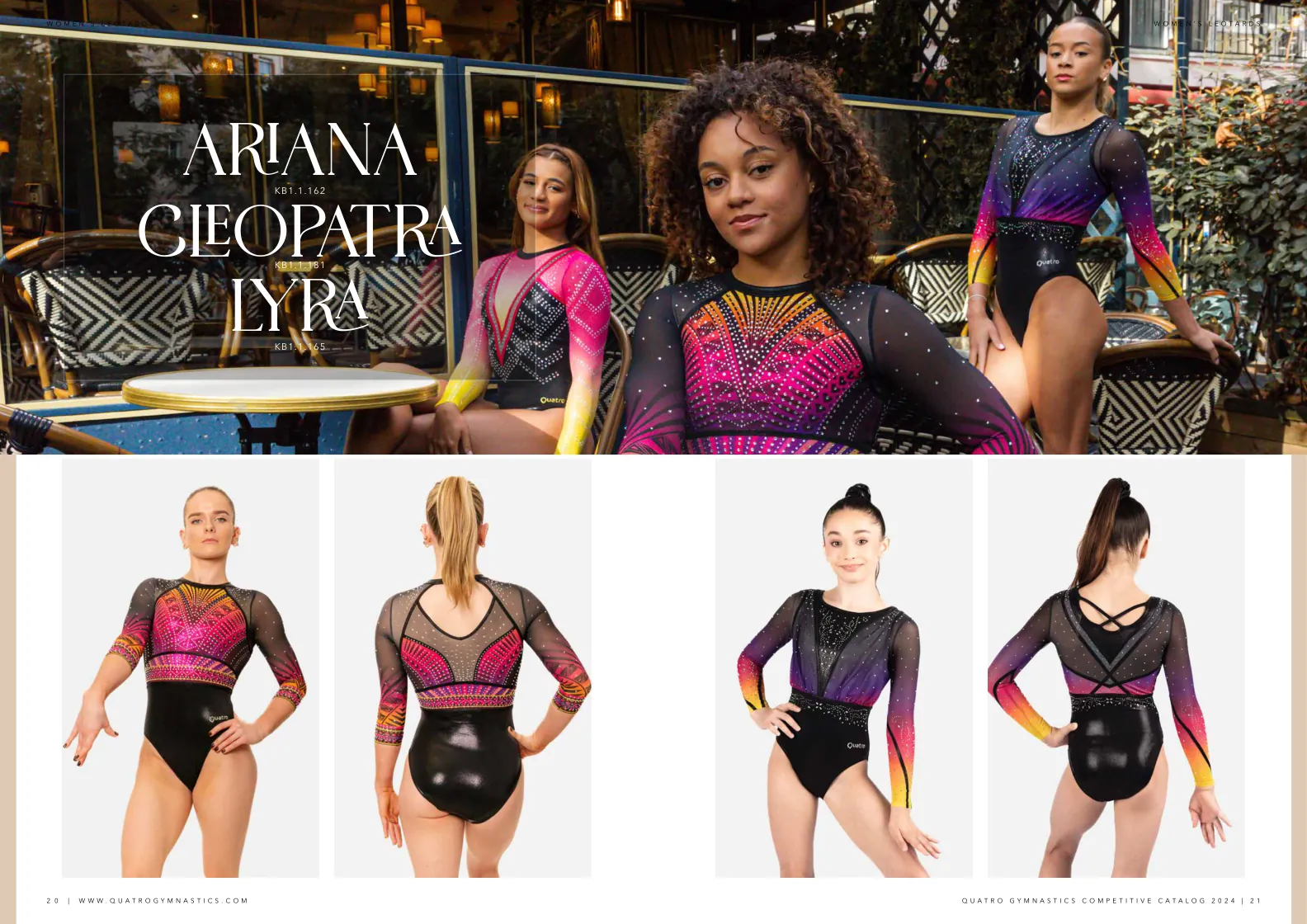
I balanced large editorial images with repeatable product layouts: consistent front and back views, clear naming, and room for regional information. The system carries across an 88-page A4 catalog and smaller collection publications.
Europe / USA — 2022
Multiple markets.
One visual system.
The 2022 Spotlight collection adapts from European A5 (148 × 210 mm) to U.S. Half Letter (5.5 × 8.5 in). The product hierarchy stays consistent while the page proportions and currency change. Quatro’s wider catalog work also includes UK editions.
Switch between matching product pages from the 22-page European and U.S. edition PDFs. Select the artwork to see it at a larger size.
Product Catalog 2024 / 36 pages
Complex content.
Clear structure.
A detailed wellness product catalog with several layers of information — technical descriptions, ingredient breakdowns, product differences, dosage tables, and regulatory notes. The design gives readers a repeatable information hierarchy across the publication.
My contribution Editorial layout, typography, technical table design, and Adobe InDesign production.
2025 / 12 pages
From layout
to printed piece.
A B2B publication covering professional skincare devices and product ranges. The layouts organize features, treatment benefits, before-and-after images, and varied product information into a readable brochure.
My contribution Brochure design, device and product-range layouts, and Adobe InDesign production.
25-second footage of the printed publication being handled and paged through — real production, not a digital mockup.
and handover
A publication
your team can extend.
I work directly with clients from editorial direction to page-by-page execution. For an internal team, that can extend to reusable layouts, clear written guidance, and an organized InDesign handover.
Layouts with logic.
Clear page grids, margins, paragraph styles, image placement and hierarchy — so new product pages remain consistent.
Editorial principles.
Distinct approaches for lifestyle storytelling and product data, united by a coherent typographic and image system.
Usable source files.
For your team, I can provide organized Adobe InDesign files, linked assets and licensed fonts, with written guidance and an optional recorded walkthrough.
Sofia / Working worldwide
The right amount
of restraint.
The right amount
of detail.
I’m a senior multidisciplinary brand and creative designer working across identity, editorial direction, and product presentation—from the visual world to the files that bring it into production. This selection focuses on the publication experience relevant to Rainware’s brief.